How Stock Chart Helps You in Your Analysis?
- The stock chart records the price and volume data history to help you determine whether the stock value is increasing or decreasing.
- The stock chart gives you clues about whether the price behaves normally or abnormally.
- The stock chart tells you the direction of the trend, whether the stock is at the beginning of the trend or the end of the trend.
- The stock chart helps you to pinpoint your entry, exit, and stop-loss levels.
- To trade well, you must understand how to read a stock chart.
Learn Stock Chart Types
The stock chart can vary in its construction from bar charts to candle charts to a line chart to a volume chart. Almost all the popular trading software will provide you option to switch between the various types of stock graphs, as well as the ability to overlay various technical indicators on the chart. You can also vary the time frame shown by a chart.
Stock charts are classified into different types depending on how they represent price; a few of these charts are discussed below:
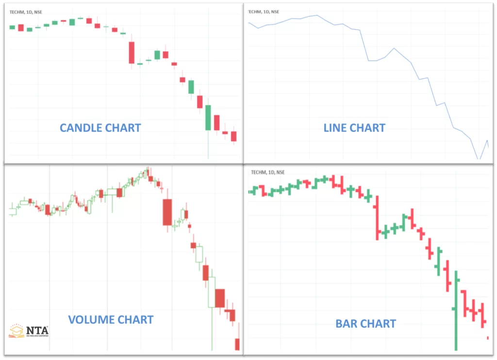
Candlestick Chart
- It shows four pieces of information: the opening price, closing price, high of the day, and low of the day.
- This chart has two main parts shadow and the body.
- Shadow: It is a thin part representing the day's price action as it differs from its high and low prices.
- Body: The wide part of the candle is called the real body, it forms between the close and open price value, and it is green if the price closed above the open price, otherwise it would be red.
Bar Chart
- This is one of the most used charts
- It shows four pieces of information: the opening price, closing price, high of the day, and low of the day.
- The vertical line shows the day trading range.
- Horizontal line points left to mark the opening price.
- Horizontal line points right to mark the closing price.
Line Chart
- A line chart measures only the closing price and connects each day's close into a line.
- The line chart is quite informative in allowing the user to visualise trends.
- Identifying swing high and swing low is quite easy inline chart.
Volume Chart
- It consists of five components: open, high, close, low, and volume.
- Volume detriment the width of the candle.
- In a volume candle, volume merges into candlesticks.
- It allows you to analyse both price and volume with one look at the price chart.
Stock Chart Components
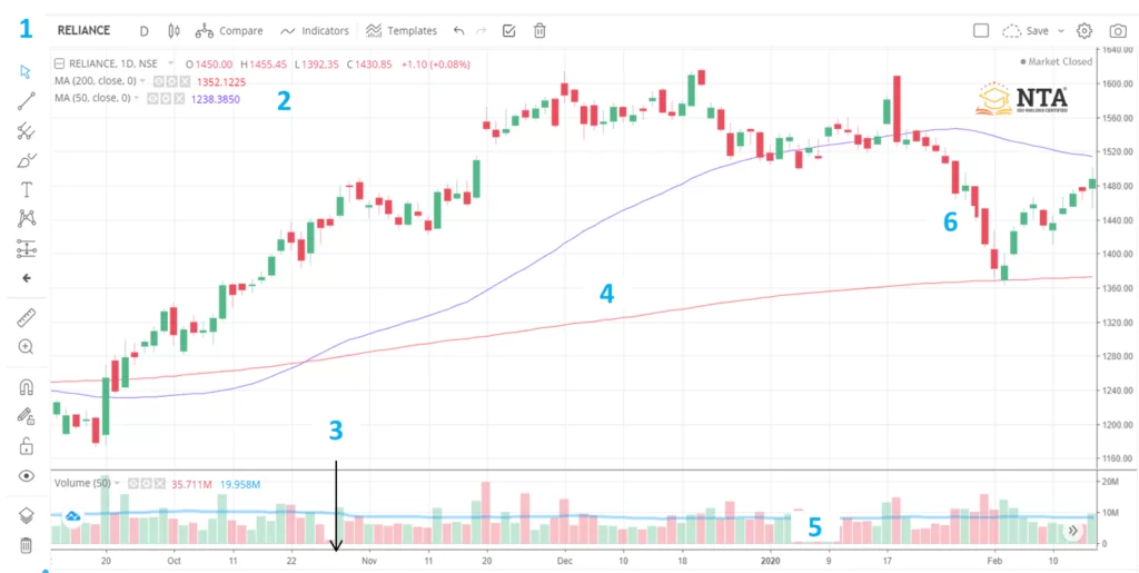
1. Chart identification
- Every chart is a label and tells you exactly what you are looking at.
- If you look to the left, you can see very clearly that we are looking at a chart of RELIANCE.
- RELIANCE is the ticker for the Reliance industry.
2. Summary key
- To the left of this number, it says “daily”, which means we are looking at a daily chart of the index.
- Here, you get open, high, low, and close data along with percentage gain and point gain in the stock.
- Below this, we can see the blue and red lines, which are (50 and 200 moving averages.
3. Period
- The X-axis always displays period.
- You can view the chart for 1 minute within the monthly time frame.
4. Technical Study
- In this chart, we are using a moving average in technical analysis.
- Moving resistance is a form of technical analysis that helps you identify the trend direction.
- On the chart, the red line is the 200-day moving average and the blue is the 50-day moving average; a crossover of the 200 and 50 MA is called a golden crossover.
- Along with the moving average, the Chart allows you to use many different forms of technical analysis for Intraday Trading.
5. Volume
- Trading volume is the total number of shares that were traded during that day.
- A trader uses volume to confirm the continuation or reversal of the trend.
- The blue line going through the top is the 50-period average of the volume
- The volume bar above the 50-period averages indicates that a larger number of stocks were traded during that particular day.
6. Daily Trade Range
- Just like volume, each red and green vertical candle represents one trading day.
- If the candle is red, that means the stock is down compared to the previous day.
- If the candle is green, that means the stock price compares to the previous day.
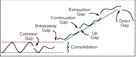
Gaps and Their Types
- Gaps are areas on a chart where a stock price either rises or falls from the previous day's close with no trading occurring in between.
- A gap occurs mainly when a news or an event creates a flood of buyers or sellers in a share.
- Result in the price opening higher or lower than the previous day's close.
- Gaps are divided into four types:
1. Common Gap
Most commonly occur in a range-bound market
2. Breakaway Gap
It occurs when a price breaks away from an area of consolidation.
3. Runaway Gap
The occurrence in the middle of an uptrend or downtrend market indicates further continuation of the trend.
4. Exhaustion Gap
The signal end of the move mostly occurs at the end of the trend.
How to read Nifty 50 chart?
Reading a Nifty 50 chart involves understanding price movements, trends, and key indicators such as support, resistance, volume, and candlestick patterns. Start by observing whether the index is in an uptrend or a downtrend, then analyse candlesticks to interpret market sentiment. Checking moving averages and RSI can help identify momentum and potential reversal points. By combining these elements, traders gain better clarity on market direction and entry or exit opportunities.
How to Read Volume like a Pro?
- Volume measures the number of shares traded in a stock or contract in future or options.
- It is one of the most basic concepts to understand when trading stock.
- Almost every technical intraday trading indicator that is used in the analysis involves either the price itself or some variation of it; volume can offer a new dynamic of interpretation.
Benefit of Volume Studies
- When price and volume are compared, it is important to see whether they agree agreement if so probability favours an extension of the trend.
- If price and volume vary, this tells us that the underlying trend is not as strong as it looks on the surface.
Principles of Volume Interpretation
- The most important principle is that volume generally goes with the trend.
- The combination of rising volume with rising price is normal; it indicates that the trend is gaining strength.
- In a bull market rise in price is followed by a rise in volume; if a new high in price is not confirmed by higher volume, it actually indicates the weakness of a trend.
- Rising prices accompanied by a trend of falling volume are an abnormal situation; it indicates weakness.
- Sometimes both price and volume expand sharply, resulting in a parabolic move, which represents an exhaustion move and is characteristic of a trend reversal.
- A downside breakout from a price pattern, trend lines, or moving average that occurs on heavy volume is abnormal and is a bearish sign that confirms the trend reversal.
- When the price is in a sideways market after a big rally, and volume is increasing in that sideways market, it is a bearish sign.
- High volume at a major low is usually a very reliable signal that a significant bottom has been seen.
How to Spot a Trend in a Chart?
1. Uptrend
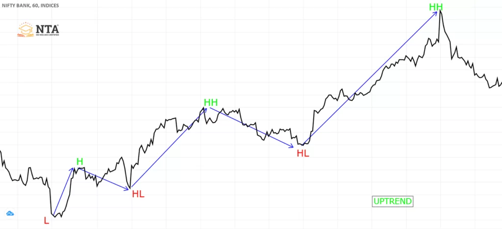
- An uptrend is a formation of higher highs and higher lows.
- Whenever the last higher low of the rally is broken uptrend is said to be over.
- Downtrend may start after the higher low is broken and new lower lows are formed.
2. Downtrend
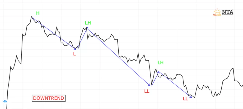
- A downtrend is a formation of lower highs and lower lows.
- Whenever the last lower high of the downtrend is broken downtrend is said to be over.
- Uptrend may start after the last lower high is broken and new higher lows are formed.
Different Phases of the Market Cycle in a Chart
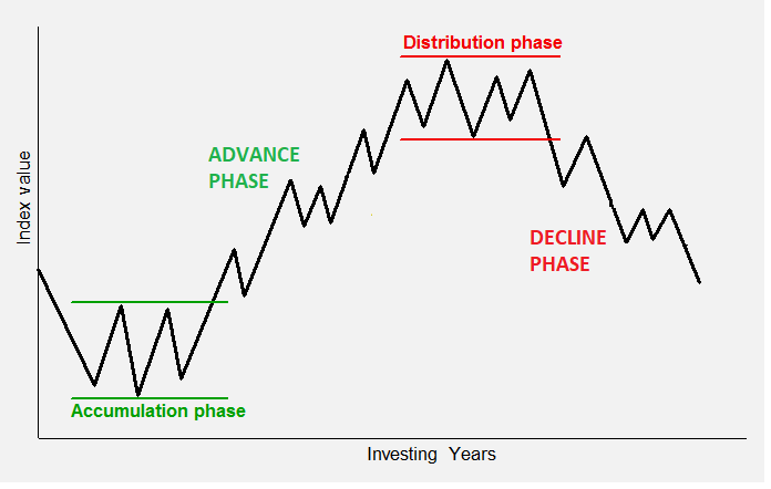
1. Accumulation
- During this phase price is in a range bond market, moving between support and resistance.
- Long-term moving averages are flat.
- Big brokers, investors, and institutions are buying good companies in this phase.
2. Advancing
- In a bull market, after a breakout of the upper boundary of the accumulation phase, prices rise sharply. That phase is called advancing,
- Mass participants occur, all the retail traders and investors are jumping into the stock, causing the price to rise sharply, along with increased volume.
3. Distribution
- It’s the final phase; those who were holding the share since the accumulation phase are now looking to book a profit.
- Meanwhile, the retail traders are astonished by the advancing phase; they look at distribution as a pause in the market, but the expectation of to trend continues.
- Exchange of shares happens here, from strong hand to weak hand. As a big broker, investor, or institution, it books a profit.
- After this phase over the decline in the share price occurs.
4. Decline
- It occurs after the price breaks the low of the distribution phase.
- Price sustains below the 200 moving averages.
- 200 The moving average indicates a downtrend.
- Most of the big investors have already closed the long position and booked a profit.
What is a Candlestick And Why Does It Occur in a Chart?
- When the price is in a support or resistance zone, and there is a clear dominance of either buyers or sellers, because of this dominance of buyers or sellers, the bullish and bearish candle occurs.
- A candlestick chart shows the market open, high, low, and close prices for the day.
- The candlestick has a wide part, which is called the body.
- This real body represents the price range between the open and close of the day.
- When the real body is filled green, it means the open was lower than the close.
- If the real body is red, it means the close was higher than the open.

Candlesticks can be classified as:
1. Bullish Candle
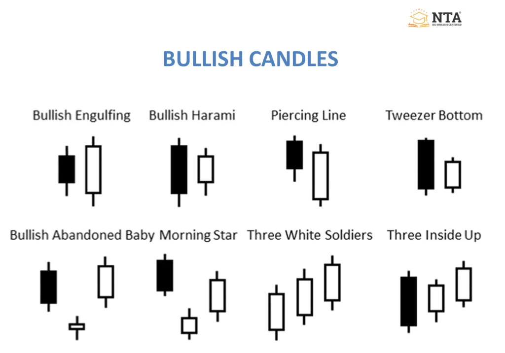
- Bullish engulfing.
- Bullish harami.
- Bullish kicker.
- Piercing line.
- Morning star.
- Three inside up.
- 3-white soldier.
Note: A Bullish candlestick represents that the bulls are dominating the bears in the market. Any bullish candle occurring at support, oversold region or at the bottom of a downtrend should be emphasised as they indicate a high possibility of a reversal in the market.
2. Bearish Candle
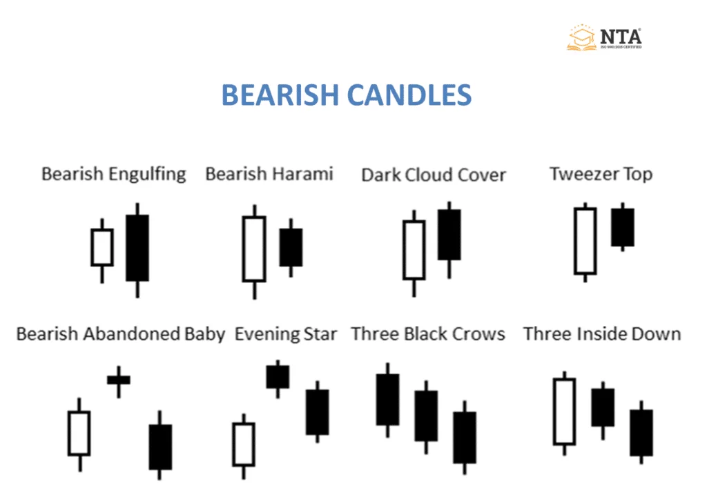
- Bearish engulfing.
- Bearish harami.
- Bearish kicker.
- Dark cloud.
- Evening Star.
- Three inside down.
- 3 black crows.
Note: A Bearish candlestick represents that the bears are dominating the bulls of the market. Any bearish candle occurring at resistance, overbought region, or at the top of an uptrend should be emphasised as they indicate a high possibility of a reversal in the market.
3. Rejection Candle

- Hanging man and shooting star (after an uptrend) Bearish sign.
- Hammer and inverted hammer (after a downtrend) are Bullish signs.
Note: The bullish and bearish rejection patterns are reversal Patterns and occur in conjunction with support or resistance lines. Reflect the failure of the price to sustain in an area and indicate a possible reversal point.
4. Indecisive Candle
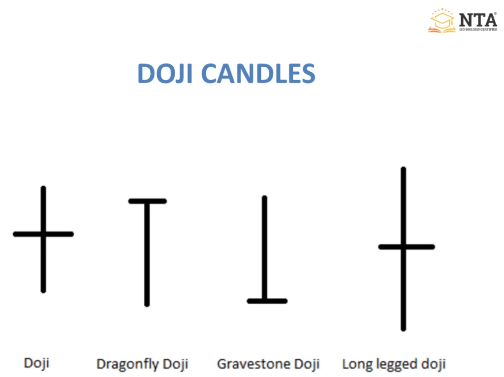
- Doji.
- Dragonfly Doji.
- Gravestone Doji.
- Long-legged Doji.
Note: It represents indecision between bull and bear. It is quite often found at the bottom and top of the trend and thus is considered a sign of a possible reversal in price direction.
Using Technical Indicators in a Chart
- The technical indicator is a mathematical calculation based on the price or volume.
- In providing a different outlook on the strength or weakness of the price movement.
- The technical analyst looks for historical data to judge entry and exit points for trades.
- The technical indicator falls into two categories,
a) Overlay: Those indicators which are plotted over the top of the price are overlay indicators like moving averages, VWAP, etc.
b) Oscillator: That indicator that oscillates between a local minimum and a local maximum is called an oscillator, like MACD, RSI, and stochastic.

Technical analysis is used for:
- To confirm: The Indicator is used to confirm entry based on price action.
- To predict: To forecast the future price levels of a share or an index.
- To alert: The Technical indicator gives alerts like breakout, positive divergence.
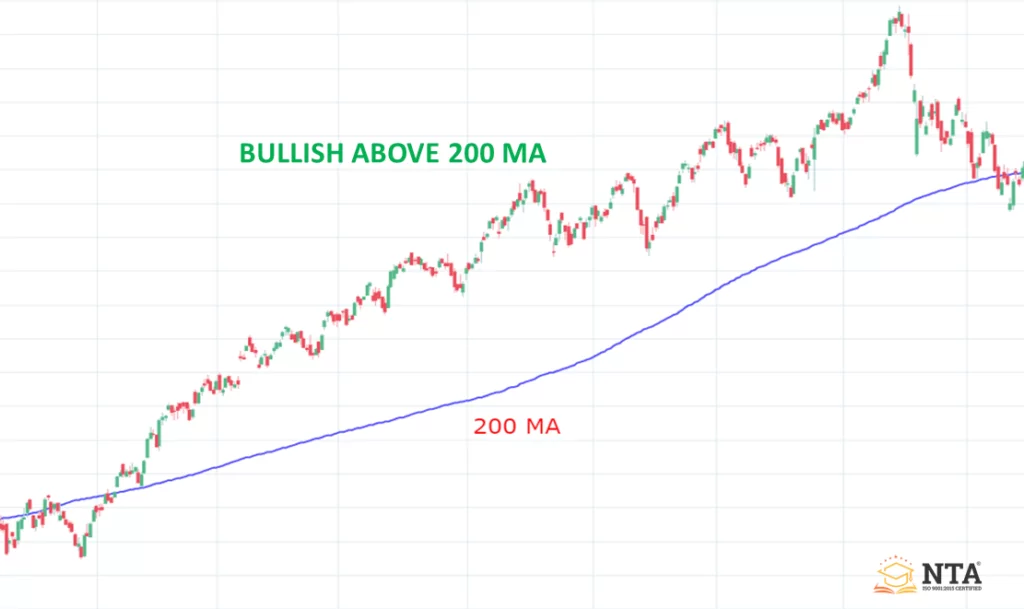
Using a 200 Period Moving Average to Spot the Trend in the Chart
- The 200-day moving average is a line that is formed by adding the average security closing price over the last 200 days.
- It is one of the most popular technical indicators that helps to identify the market trend, and it defines the long-term trend of the market.
1. Bullish Market: If the price is closing above the 200-period moving average, it is called a bullish market.
2. Bearish Market: If the price is closing below the 200-period moving average, it is called a bearish market.
Conclusion:
In this article, NTA® have defined a stock chart, and how you can use it in your trading for the better trading decision, we have defined different element of the chart like volume, price, identification of trend, identifying bullish and bearish move, a different phase of the market which you should use in your analysis to understand the emotion behind the price. You can also use any available indicator in your studies. Along with the technical aspect of trading, it is equally important for you to have a good risk management strategy.