Based on the past Chart statistics, forecast of future price movements can be easily done. This kind of study is known as technical analysis. As per the general assumption, price patterns repeat like the repeating history and the results of the study can be shown in the form of charts for easy understanding. With this method, people can easily analyze prevailing market statistics and thereby evaluate the existing stocks. Mass psychology supports only this kind of output.
This Stock Chart Technical Analysis does not end in complete predictions regarding the price movements in future. However, it guides the investors to expect what is going to happen to the prices. It is not concerned with the intrinsic value of the stocks and hence it will not indicate the cost of a stock. What it can reveal is whether the investments can turn into gain or loss by solving the problem of timing.For this analysis, different types of charts are used showing the price over time.
Investors must keep in mind that this technical analysis is not a science. It is an art with subjective approach and so is open for interpretation. It is largely flexible that it can suit to the style of the individual, who trades or invests seriously. Such a style development for any trader or investor will take time along with their untiring perseverance and constant effort. In addition, streamlined courses from us will take you to the next level of expertise.
Technical analysis is made easy with the help of these charts because they represent the price movements in the visual format. Following are different types of charts that are used by the traders and investors to study the price fluctuations of stocks.
This chart represents the closing price. When the trader or investor takes a series of closing prices, they will be visible as dots linked by a line in the chart. By going through this line, one can easily know the present behavior of that particular stock. Closing prices is considered as the most powerful and important information that reveals the end of the game and informs about the winner. This chart is the simplest one with powerful information.

This is the popular chart among traders and investors due to its large amount of information it reveals. This chart displays four types of information to the user. It provides details on Open, High, Low and Close prices. People focus more on the Low and High prices of bar chart than the other details. The price movements within a given period can be studied clearly using this chart.


Japan, 150 years ago, introduced Candlestick Chart which points out the Open, Close, High and Low price movements like the bar chart. It will display a white body candle if the closing price is more than the opening price and a black body candle if the closing is lower than the opening price. White candle stick is considered as Bullish whereas the black candle stick is Bearish and the distance between the Open and Close position is called ‘Real Body’. Again, the distance between Real Body and High is considered as ‘Upper Shadow’ whereas Real Body and Low is ‘Lower Shadow’. This chart clearly shows the market direction.
Must Read – Difference Between Chart Pattern and Candlestick Pattern


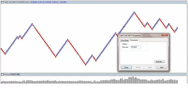
Renko, derived from the Japanese word ‘renga’, means brick. Bullish white bricks and Bearish black bricks are used in this chart also. The brick sizes are already determined. When the prices move more than the last brick size, then a new brick is added. This chart is not related with time and is very useful to know the current trend by providing clear indication.Further, it also eliminates the noise factor created by the price movements. The brick positions will remain same without any change if the price movements are not up to the expected level.


This is completely different from the above mentioned bar or candlestick chart types. It does not bother about either volume or time. It has two columns as X and O; when the price movement is upwards, X column rises and when the price movement is downwards then O column rises. Hence, X is ‘bullish’ and O is ‘bearish’. Each column will have either X or O but not both. The box size must be multiplied by ‘reversal amount’ so that columns can be changed. For example, if the reversal amount is 3 and the box size is 10, the price will move 30 points [10 x 3] in order to change the column. Change in the current trend is indicated by the change in the columns.

Introduced in Japan, Steve Nison popularized this in western countries.It is named thus due to the number line blocks represented. Rising and falling prices are represented by white and black lines respectively. When the closing price is higher or lower than the two lines already there, a reversal procedure takes place by introducing a new white or black block. According to Meta stock Help, “To draw line break blocks, today’s close is compared to the high and low of the previous block. A block is drawn only when today’s close exceeds the high or low of the previous block.
If today’s close is higher than the top of the previous block, a new white block is drawn in the next column from the prior high to the new high price. If today’s close is lower than the bottom of the previous block, a new black block is drawn in the next column from the prior low to the new low price. If the close fails to move outside the range of the previous blocks high or low, then nothing is drawn”.


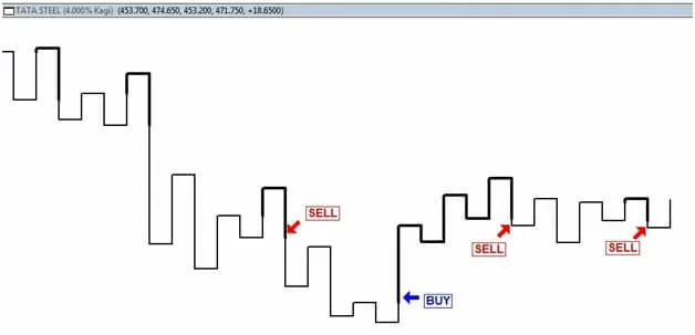
This chart system also is introduced in Japan and is popularized in Western countries by Nison. Kagi in Japan means woodblock printing art. The lines in this chart indicate the price movements by its thickness. This chart does not include time aspect. The lines extend if the closing price continues inthe same direction and in case the price movement is reversed the new lineis drawn in opposite direction. Moreover, the moment the closing price penetrates the last column, the line thickness changes. Thisis very useful for the trader who wants to know about the major price swings.


One of the most popular methods of using this Kagi Chart is to wait for a thin line and go along the thick line which is very recent. It represents the latest high swing.
Start Your Share Market Course Here: Share Market Training
Start Your Share Market Course Here: Technical Analysis Course